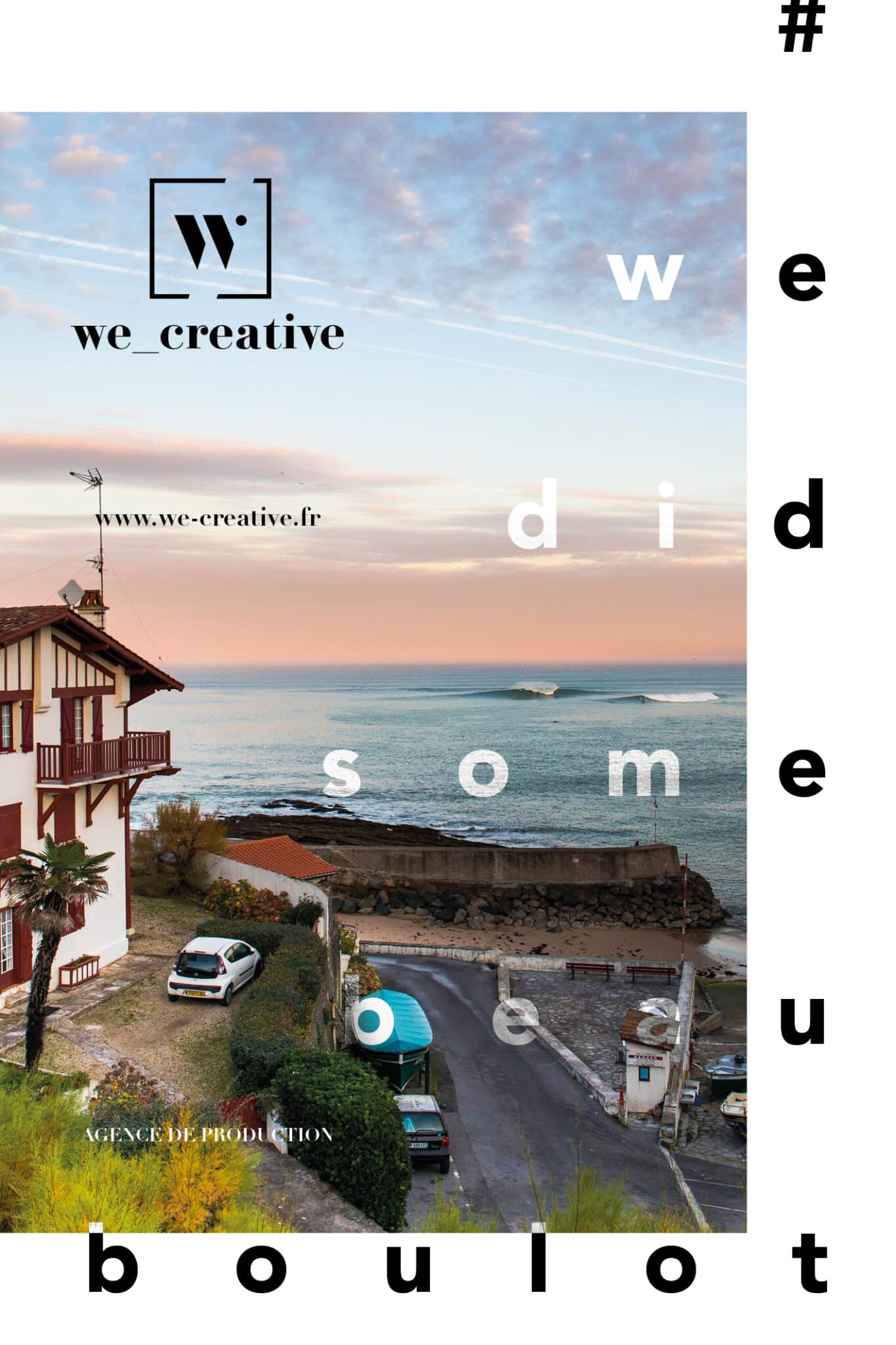
we_creative
Création d’une charte graphique et d’une page de publicité pour l’agence de production we_creative.
français
Lancement d’une nouvelle agence de production avec Guillaume Arrieta et création de la charte graphique de l’entreprise, avec au menu, un logo et une page de publicité, en plus du site internet.
Ma principale question reste toujours : qu’il y a-t-il de plus beau que deux personnes qui officialise leur union ? Non, je ne me suis pas marié mais en quelque sorte un peu quand même. Fatigués d’être ‘des copains qui travaillent ensemble’, nous avons décidé avec Guillaume Arrieta de monter une agence de production sous laquelle nous regrouperons certains de nos projets. C’est plus facile sur beaucoup de points, mais ça permet également d’avoir l’air plus sérieux (on part de loin mais on progresse !) quand on doit se présenter à des grandes agences ou des clients de plus grandes ampleurs.
Ayant chacun nos compétences respectives, je me suis mandaté pour la communication et la charte graphique, qui n’est quand même pas bien complexe. Au programme, un logo et dans la foulée, une page de publicité pour un magazine avec qui nous étions en partenariat. Concernant le logo, je voulais faire simple et élégant, j’ai donc repris une Didot, que j’ai un peu retravaillé et épaissi pour en isoler uniquement les barres du W. Le rond permet de terminer la lettre, avec le cadre donne une dynamique vers le haut (on sait à quel point ça compte…). La typographie du bas a ensuite été retravaillée, également à partir du Didot pour incorporer les différents élément et ainsi uniformiser l’ensemble. Le symbole a été dessiné pour pouvoir également être utilisé tout seul.
Concernant la page du publicité, vu que nous n’avons pas grand chose à vendre, c’est une communication de marque que l’on a fait. Le texte nous sert de slogan et reste une des phrases nous identifiant. Les autres éléments viennent ajouter du dynamisme.
Pour ceux qui sont curieux de notre travail, c’est par là que ça se passe.
anglais
Launch of a new production agency with Guillaume Arrieta and creation of the company’s graphic charter, with a logo and an advertising page, in addition to the website.
My main question always remains: what is more beautiful than two people who formalize their union? No, I was not married but somehow a little anyway. Tired of being ‘friends who work together’, we decided with Guillaume Arrieta to set up a production agency under which we will present some of our projects. It is easier on a lot of points, but it also allows us to look more serious (we start from far but we progress!) when we have to present ourselves to agencies or clients of larger sizes.
Having each of us our respective skills, I have mandated myself for communication and the graphic charter, which is nevertheless not very complex. On the program, a logo and in the process, an advertising page for a magazine with which we were in partnership. Regarding the logo, I wanted to make it simple and elegant, so I took a Didot, which I reworked and thickened a little to isolate only the bars of the W. The circle allows to finish the letter, with the frame gives a dynamic upwards (we know how important it is …). The typography at the bottom was then reworked, also from the Didot to incorporate the different elements and thus standardize the whole. The symbol has been drawn so that it can also be used on its own.
Regarding the advertising page, since we don’t have much to sell, it’s brand communication that we did. The text serves as our slogan and remains one of the phrases identifying us. The other elements add dynamism.
For those, who would like to see how it looks, there you go.
Recent Portfolios
FFS - Saison 2020
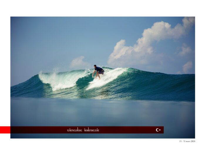
Publicité L'Equipe

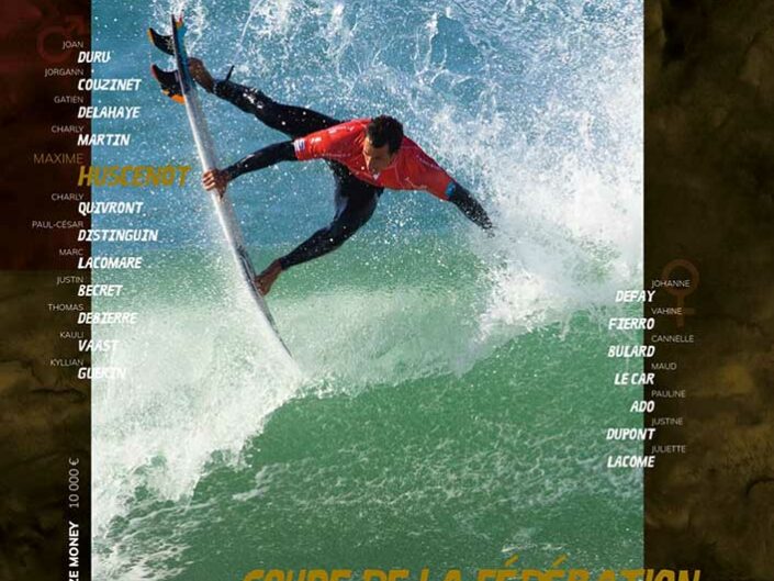
Championnats de France de Surf 2019